In response to The Daily Post’s Daily Prompt: “Paint.”
Background
I am picking up painting with watercolours again after some twenty years. I will post more photos of my atttempts at art than of real-life scenes for a while because I have been spending my cocoa evenings with watercolour.
For my readers who are here for the photos, I will keep up with photography because it is still my primary love, joy, and pleasure. However, you will see photography interspersed with the art posts. Thank you for your continued support.
Regardless, I will make sure to stick to aesthetically pleasing thumbnail photos so as to maintain the spirit of Cocoa Evenings.
Paint
I picked up a Reeves Painting by Numbers – Venice recently because I wanted to try painting a full picture and I wanted a few more colours of paint to add to my stash of only yellow, green, and blue.

I decided on Venice because the six acrylic paints provided includes the primary colours, red, yellow, and blue, and the common colours, white, black, brown, and green.
I also figured that the bright yellow-orange scene with water will look good in my room if I could complete the painting well.
Reeves Painting by Numbers come in many beautiful options such as St Basils Cathedral, Tropical Beach, and Echidnas On The Loose. They go for under SGD 10 at Art Friend.
I find the package very intuitive because I completed the initial setup with very little help from the instructions (below).

I find this Faber Castell water cup really useful after about two weeks of dabbling in watercolour again (below).

At this point, I must admit that I thought this set is a watercolour set. I made a mistake because I had not read the packaging carefully. Reeves states clearly that the paints are acrylic paints. I am still happy with what I have got.
I had to read the instructions more clearly to set up the painting canvas as that was less intuitive. I had to fold the box a little. I will advise anyone interested to purchase this set to open the box nicely if you wish to life your canvas up with the box. Do not rip up your box. I am thankful that I was gentle when opening the box or else I would have damage the box too much to construct the canvas stand (below).

I completed about half the canvas after three sittings (below).

I found painting such a picture far more time-consuming than I had expected. I might have pursue too much precision and accuracy. I reckon, some others might paint in a less formal, more carefree style – going over all the lines and seeking only rough washes.
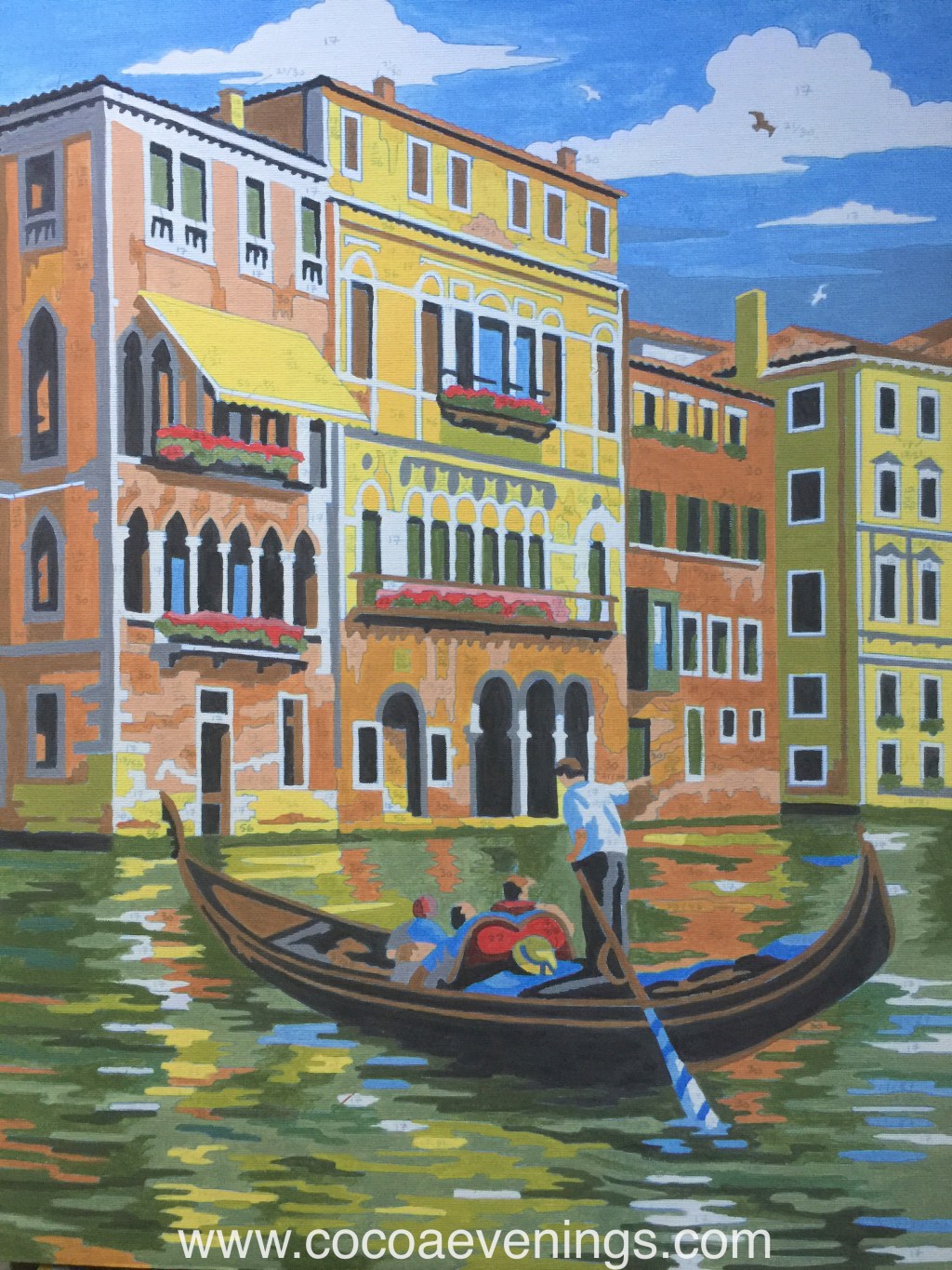
Slowly but surely, I completed the painting of Venice. I could not resist comparing my work with the digital print on the front of the packaging because I thought I had done a good job (below)!

I also realised that what I see on the packaging is what I get. I am truly happy with Reeves for producing such a beautiful package.
Based on all of the above, I have found this package to very value-for-money. I get a wonderful piece for practising my strokes, a bit of mixing, and decorating my home for only $9. I also get a lot of extra paint and a fairly good slim brush to use for art-journaling, making cards, and hand-lettering!
I present my final piece of work here, below, and I hope you like it. =D

Feelings
I felt so happy colouring in this painting and I felt a sure sense of achievement when I had completed this painting. I had never thought that I could produce an image of Venice that would make me proud. I loved colouring and painting so much when I was a child. I stopped doing any form of colouring after age twelve. I feel like a child again, very alive, and extraordinarily happy.
Learning
I have learned that colours appear relative to their surroundings. For example, the sky blue looks like a ridiculous colour to use for shadow on a white shirt when I mixed it in my palette. However, it now looks just the right kind of shadow in contrast with its surroundings. The same goes for the black yellow and the grey on the sides of the buildings. They looked like such strong colours alone but faded into a nice shadow in the larger scheme of things.
Maybe it is the same with life. At times, some things evoke very strong feelings, but take a step back and look at the big picture, all those strong feelings are speck of dust in comparison to say, the entire life, immediate family/friends, the nation, or the whole world.
The ancient Chinese saying goes,
退一步 海阔天空
Take a step back, the sea will widen and the sky will clear.
忍一时风平浪静
Tolerate for a moment, the winds will cease and the waves will calm.
I could summarise my outing with painting by numbers as “pales in comparison”. Everything will pale in comparison when one takes a wider perspective.
[I paid for the Reeves Painting by Number – Venice set.]

Leave a comment